

This article was last updated on September 06, 2024, to add sections on Advanced Column Customization and Accessibility Features in React Table.
Introduction
Most tables we use in real-world applications come with features such as filtering, sorting, and selection. Therefore, building tables from the ground up using plain markup and vanilla JavaScript can be tedious and challenging.
With libraries such as TanStack Table, you can bootstrap feature-rich tables quickly. TanStack Table is a headless, customizable, and feature-rich package for building tables and data grids.
Because it is headless by design, TanStack only has the table logic, state, and API for creating the UI components but doesn't implement the markup or styling.
You can use it with Vanilla JavaScript or popular front-end frameworks like React, Refine, Vue, Solid, and Svelte using adapters. This article will introduce you to TanStack Table and React Table, the TanStack Table adapter for react. We will also explore how to use TanStack in a Refine project.
What we'll cover in this article:
- Introduction
- What is TanStack table
- What is React Table
- How to use React Table
- How to use React Table with Refine
- Advanced Column Customization in React Table
- Accessibility Features in React Table
What is TanStack table
As explained above, TanStack Table is a headless and framework-agnostic package for building tables and data grids. It has adapters for some of the most popular front-end frameworks like React, Refine, Vue, Solid, and Svelte.
The core TanStack Table package exposes several APIs. You can access these APIs directly from the core TanStack API or one of the adapters for your front-end framework.
Some table features that TanStack Table supports out of the box include pagination, sorting, row selection, column resizing, and ordering.
What is React Table
As highlighted above, TanStack Table is framework agnostic. You can use it with front-end frameworks like React, Vue, Svelte, and Solid via adapters. These adapters make working with the core TanStack Table API easier.
The @tanstack/react-table package, referred to as React Table in short, is the TanStack table adapter for react. It wraps around the core TanStack table logic.
With the React Table adapter, you can manage state like in a typical react project.
How to use React Table
To start using TanStack Table in a react project, you need to install the React Table adapter as a dependency from the NPM package registry using the command below. The command below assumes you are using the NPM package manager.
npm i @tanstack/react-table
The React Table adapter exports the useReactTable hook. The useReactTable hook takes an options object as argument and returns a table object.
const table = useReactTable(options);
The options object has several properties, which we will not explore in detail in this article. However, you should have the data and the table column objects. The example below illustrates the basic use of the useReactTable hook.
import {
  useReactTable,
  createColumnHelper,
  flexRender,
  getCoreRowModel,
} from "@tanstack/react-table";

const columnHelper = createColumnHelper();

const data = [
  {
    firstName: "Jane",
    surname: "Doe",
    age: 13,
    gender: "Female",
  },
  {
    firstName: "John",
    surname: "Doe",
    age: 43,
    gender: "Male",
  },
  {
    firstName: "Tom",
    surname: "Doe",
    age: 89,
    gender: "Male",
  },
];

const columns = [
  columnHelper.accessor((row) => `${row.firstName} ${row.surname}`, {
    id: "fullName",
    header: "Full Name",
  }),
  columnHelper.accessor("gender", {
    header: "Gender",
  }),
];

function App() {
  const table = useReactTable({
    data,
    columns,
    getCoreRowModel: getCoreRowModel(),
  });

  return (
    <table>
      <thead>
        {table.getHeaderGroups().map((headerGroup) => {
          return (
            <tr key={headerGroup.id}>
              {headerGroup.headers.map((header) => {
                return (
                  <th id={header.id}>
                    {" "}
                    {header.isPlaceholder
                      ? null
                      : flexRender(
                          header.column.columnDef.header,
                          header.getContext(),
                        )}
                  </th>
                );
              })}
            </tr>
          );
        })}
      </thead>
      <tbody>
        {table.getRowModel().rows.map((row) => {
          return (
            <tr key={row.id}>
              {row.getVisibleCells().map((cell) => {
                return (
                  <td key={cell.id}>
                    {flexRender(cell.column.columnDef.cell, cell.getContext())}
                  </td>
                );
              })}
            </tr>
          );
        })}
      </tbody>
    </table>
  );
}

export default App;
As the example above illustrates, React Table is headless. Therefore, you are responsible for the markup and styling. You must pass the table data and table header array as arguments to the useReactTable hook.
In the above example, we used the createColumnHelper from the core TanStack Table to create accessor column definition type.
The useReactTable returns an object consisting of several methods you can use to render the table. The getHeaderGroups method returns the header group. Similarly, the getRowModel returns the final row model. You can use the two properties to render the table UI as in the above example.
The table object has several other properties that you can look up in the React Table documentation.
How to use React Table with Refine
TanStack Table is framework agnostic. Therefore, you need an adapter to use it with front-end frameworks like Refine. The Refine ecosystem has the @refinedev/react-table adapter for integrating TanStack Table into your Refine application.
Depending on your package manager, first, install it from the NPM package registry. The command below assumes you're using the NPM package manager.
npm i @refinedev/react-table
Under the hood, the @refinedev/react-table package uses Refine's useList hook. It has out-of-the-box support for all the features of the core TanStack table package and much more.
The @refinedev/react-table package exports the useTable hook. The useTable hook reads the resource from the URL and returns the data from the API endpoint in its basic usage.
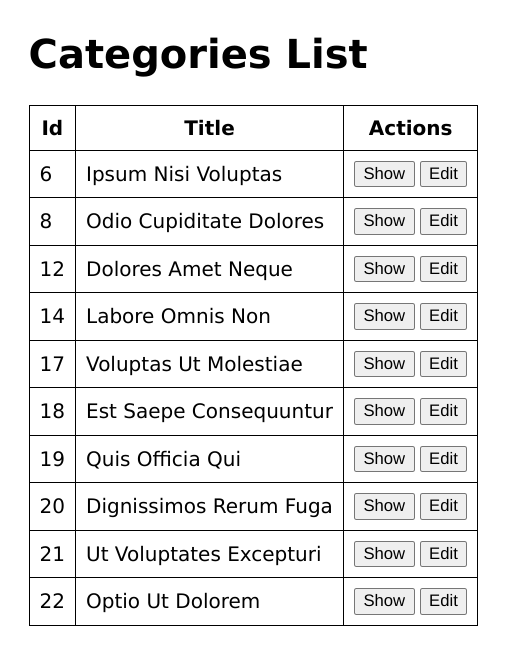
The code below illustrates how to use React Table with refine. If you have a running Refine project already, use the example code below to display data from the categoriesresource of the fake REST API in tabular form using the @refinedev/react-table package.
The fake REST API was created by the Refine team to try out the examples in refine.
Show CategoryList component
import React from "react";
import { useNavigation } from "@refinedev/core";
import { useTable } from "@refinedev/react-table";
import { ColumnDef, flexRender } from "@tanstack/react-table";

export const CategoryList = () => {
  const columns = React.useMemo<ColumnDef<any>[]>(
    () => [
      {
        id: "id",
        accessorKey: "id",
        header: "Id",
      },
      {
        id: "title",
        accessorKey: "title",
        header: "Title",
      },
      {
        id: "actions",
        accessorKey: "id",
        header: "Actions",
        cell: function render({ getValue }) {
          return (
            <div
              style={{
                display: "flex",
                flexDirection: "row",
                flexWrap: "wrap",
                gap: "4px",
              }}
            >
              <button
                onClick={() => {
                  show("categories", getValue() as string);
                }}
              >
                Show
              </button>
              <button
                onClick={() => {
                  edit("categories", getValue() as string);
                }}
              >
                Edit
              </button>
            </div>
          );
        },
      },
    ],
    [],
  );

  const { edit, show } = useNavigation();

  const {
    getHeaderGroups,
    getRowModel,
    setOptions,
    refineCore: {
      tableQuery: { data: tableData },
    },
  } = useTable({
    columns,
  });

  setOptions((prev) => ({
    ...prev,
    meta: {
      ...prev.meta,
    },
  }));

  return (
    <div style={{ padding: "16px" }}>
      <div
        style={{
          display: "flex",
          alignItems: "center",
          justifyContent: "space-between",
        }}
      >
        <h1>Categories List</h1>
      </div>
      <div style={{ maxWidth: "100%", overflowY: "scroll" }}>
        <table>
          <thead>
            {getHeaderGroups().map((headerGroup) => (
              <tr key={headerGroup.id}>
                {headerGroup.headers.map((header) => (
                  <th key={header.id}>
                    {!header.isPlaceholder &&
                      flexRender(
                        header.column.columnDef.header,
                        header.getContext(),
                      )}
                  </th>
                ))}
              </tr>
            ))}
          </thead>
          <tbody>
            {getRowModel().rows.map((row) => (
              <tr key={row.id}>
                {row.getVisibleCells().map((cell) => (
                  <td key={cell.id}>
                    {flexRender(cell.column.columnDef.cell, cell.getContext())}
                  </td>
                ))}
              </tr>
            ))}
          </tbody>
        </table>
      </div>
    </div>
  );
};
As in the above example, Refine's React Table adapter exports the useTable hook. You need to create the table column and pass it as an argument to the useTable hook.
The useTable hook returns several methods and properties that you can use to retrieve the table headers and rows and add other useful table features. Be aware that the Refine TanStack table adapter is headless. You are responsible for the markup and styling as in the above example.
The above example retrieves the data and displays it in a simple table. However, a typical table will need additional features such as pagination, sorting, and filtering. Let us explore how to add them in the sub-sections below.
Pagination
The useTable hook returns an object with several methods such as setPageIndex, getPageCount, and previousPage. You can use some of these methods to manage pagination in the table. The method names are pretty much self-explanatory.
Show CategoryList component
import React from "react";
import { useNavigation } from "@refinedev/core";
import { useTable } from "@refinedev/react-table";
import { ColumnDef, flexRender } from "@tanstack/react-table";

export const CategoryList = () => {
  ...
  const {
    getHeaderGroups,
    getRowModel,
    setOptions,
    refineCore: {
      tableQuery: { data: tableData },
    },
    getState,
    setPageIndex,
    getCanPreviousPage,
    getPageCount,
    getCanNextPage,
    nextPage,
    previousPage,
    setPageSize,
    getColumn,
  } = useTable({
    columns,
  });

  setOptions((prev) => ({
    ...prev,
    meta: {
      ...prev.meta,
    },
  }));

  return (
    <div style={{ padding: "16px" }}>
      ...
      <div style={{ marginTop: "12px" }}>
        <button
          onClick={() => setPageIndex(0)}
          disabled={!getCanPreviousPage()}
        >
          {"<<"}
        </button>
        <button onClick={() => previousPage()} disabled={!getCanPreviousPage()}>
          {"<"}
        </button>
        <button onClick={() => nextPage()} disabled={!getCanNextPage()}>
          {">"}
        </button>
        <button
          onClick={() => setPageIndex(getPageCount() - 1)}
          disabled={!getCanNextPage()}
        >
          {">>"}
        </button>
        <span>
          <strong>
            {" "}
            {getState().pagination.pageIndex + 1} / {getPageCount()}{" "}
          </strong>
        </span>
        <span>
          | Go to page :{" "}
          <input
            type="number"
            defaultValue={getState().pagination.pageIndex + 1}
            onChange={(e) => {
              const page = e.target.value ? +e.target.value - 1 : 0;
              setPageIndex(page);
            }}
          />
        </span>{" "}
        <select
          value={getState().pagination.pageSize}
          onChange={(e) => {
            setPageSize(Number(e.target.value));
          }}
        >
          {[10, 20, 30, 40, 50].map((pageSize) => (
            <option key={pageSize} value={pageSize}>
              Show {pageSize}
            </option>
          ))}
        </select>
      </div>
    </div>
  );
};
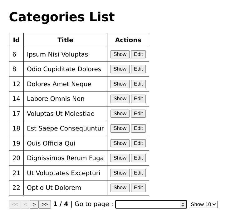
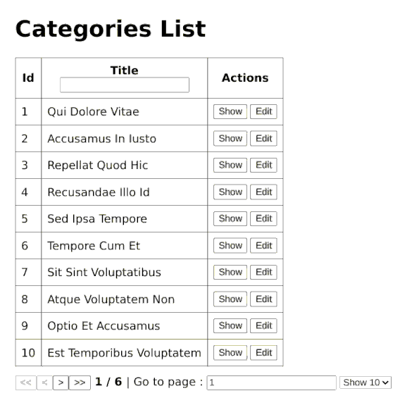
After adding the changes above, you can now navigate to any page of the data. By default, pagination is handled on the server side. If you want pagination to be handled on the client side, set the value of the pagination.mode property to "client" like so:
useTable({
  columns,
  refineCoreProps: {
    pagination: {
      mode: "client",
    },
  },
});
If you set the value of the syncWithLocation feature to true, the useTable state is automatically encoded in the URL parameters. Any change in the useTable state also updates the URL and vice versa.
The value of the syncWithLocation feature is set to false by default. You can either set its value globally using the <Refine /> component or the useTable hook like so:
useTable({
  refineCoreProps: {
    syncWithLocation: true,
  },
});
Sorting
Similar to pagination, the object returned by the useTable hook has methods you can use to manage sorting. Let's explore how to sort data in this sub-section. Add the changes below to your code.
import React from "react";
import { useNavigation } from "@refinedev/core";
import { useTable } from "@refinedev/react-table";
import { ColumnDef, flexRender } from "@tanstack/react-table";

export const CategoryList = () => {
  ...
  return (
    <div style={{ padding: "16px" }}>
      <div
        style={{
          display: "flex",
          alignItems: "center",
          justifyContent: "space-between",
        }}
      >
        <h1>Categories List</h1>
      </div>
      <div style={{ maxWidth: "100%", overflowY: "scroll" }}>
        <table>
          <thead>
            {getHeaderGroups().map((headerGroup) => (
              <tr key={headerGroup.id}>
                {headerGroup.headers.map((header) => (
                  <th key={header.id}>
                    {header.id === "title" ? (
                      <div onClick={header.column.getToggleSortingHandler()}>
                        {!header.isPlaceholder &&
                          flexRender(
                            header.column.columnDef.header,
                            header.getContext()
                          )}
                        {{
                          asc: " 🔼",
                          desc: " 🔽",
                        }[header.column.getIsSorted() as string] ?? null}
                      </div>
                    ) : (
                      <div>
                        {!header.isPlaceholder &&
                          flexRender(
                            header.column.columnDef.header,
                            header.getContext()
                          )}
                      </div>
                    )}
                  </th>
                ))}
              </tr>
            ))}
          </thead>
          <tbody>
            {getRowModel().rows.map((row) => (
              <tr key={row.id}>
                {row.getVisibleCells().map((cell) => (
                  <td key={cell.id}>
                    {flexRender(cell.column.columnDef.cell, cell.getContext())}
                  </td>
                ))}
              </tr>
            ))}
          </tbody>
        </table>
      </div>
      ...
    </div>
  );
};
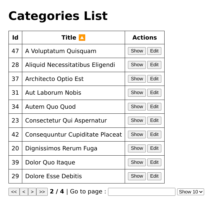
You can now click the Title header to sort the table in ascending or descending order of the title.
Filtering
Similar to pagination and sorting explained in the previous two sections, the object returned by the useTable hook has methods for filtering.
When defining the table column, you can specify which columns can be filtered and specify the filter operator using the filterOperator property of the meta object. The default filter operator is "eq" for all fields.
Add the following changes to the code above.
Show CategoryList component
import React from "react";
import { useNavigation } from "@refinedev/core";
import { useTable } from "@refinedev/react-table";
import { ColumnDef, flexRender } from "@tanstack/react-table";

export const CategoryList = () => {
  const columns = React.useMemo<ColumnDef<any>[]>(
    () => [
      {
        id: "id",
        accessorKey: "id",
        header: "Id",
      },
      {
        id: "title",
        accessorKey: "title",
        header: "Title",
        meta: {
          filterOperator: "contains",
        },
      },
      {
        id: "actions",
        accessorKey: "id",
        header: "Actions",
        cell: function render({ getValue }) {
          return (
            <div
              style={{
                display: "flex",
                flexDirection: "row",
                flexWrap: "wrap",
                gap: "4px",
              }}
            >
              <button
                onClick={() => {
                  show("categories", getValue() as string);
                }}
              >
                Show
              </button>
              <button
                onClick={() => {
                  edit("categories", getValue() as string);
                }}
              >
                Edit
              </button>
            </div>
          );
        },
      },
    ],
    []
  );
  ...
  return (
    <div style={{ padding: "16px" }}>
      <div
        style={{
          display: "flex",
          alignItems: "center",
          justifyContent: "space-between",
        }}
      >
        <h1>Categories List</h1>
      </div>
      <div style={{ maxWidth: "100%", overflowY: "scroll" }}>
        <table>
          <thead>
            {getHeaderGroups().map((headerGroup) => (
              <tr key={headerGroup.id}>
                {headerGroup.headers.map((header) => (
                  <th key={header.id}>
                    {header.id === "title" ? (
                      <div onClick={header.column.getToggleSortingHandler()}>
                        {!header.isPlaceholder &&
                          flexRender(
                            header.column.columnDef.header,
                            header.getContext()
                          )}
                        {{
                          asc: " 🔼",
                          desc: " 🔽",
                        }[header.column.getIsSorted() as string] ?? null}
                        {header.column.getCanFilter() ? (
                          <div>
                            <input
                              value={
                                (header.column.getFilterValue() as string) ?? ""
                              }
                              onChange={(e) =>
                                header.column.setFilterValue(e.target.value)
                              }
                            />
                          </div>
                        ) : null}
                      </div>
                    ) : (
                      <div>
                        {!header.isPlaceholder &&
                          flexRender(
                            header.column.columnDef.header,
                            header.getContext()
                          )}
                      </div>
                    )}
                  </th>
                ))}
              </tr>
            ))}
          </thead>
          <tbody>
            {getRowModel().rows.map((row) => (
              <tr key={row.id}>
                {row.getVisibleCells().map((cell) => (
                  <td key={cell.id}>
                    {flexRender(cell.column.columnDef.cell, cell.getContext())}
                  </td>
                ))}
              </tr>
            ))}
          </tbody>
        </table>
      </div>
      ...
    </div>
  );
};
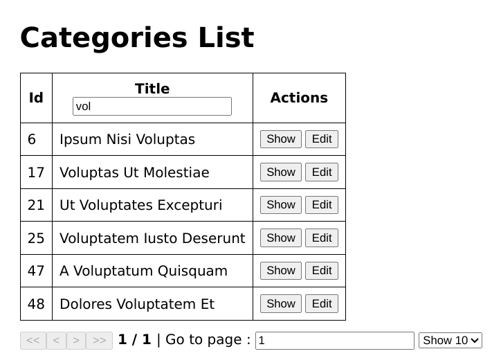
You will now see a search field that you can use to search for an entry in the title field.
There are several features of React Table that we haven't explored in this section. Check out the documentation.
Advanced Column Customization in React Table
I wanted to share some tips on Advanced Column Customization in React Table, which can really help us build more interactive and dynamic tables.
1. Custom Cell Rendering
With React Table, we can render each cell the way we want. This one is perfect if we are about to display customized content or any formatting according to need. As you can see, we have the ability to render each cell with customization according to our needs.
Here is an example:
const columns = [
  {
    accessorKey: "name",
    header: "Name",
    cell: ({ row }) => <div>{row.original.name}</div>,
  },
  {
    accessorKey: "age",
    header: "Age",
    cell: ({ row }) => (
      <span>{row.original.age >= 18 ? "Adult" : "Minor"}</span>
    ),
  },
];
In this case, we are customizing the way names are displayed and adding some logic to determine if a person is an adult or minor.
2. Conditionally Rendering in Columns
We can also utilize some conditional logic to render some different content in the table based on a condition check. This is useful when we want to show status indicators, for example.
const columns = [
  {
    status: {
      header: "Status",
      cell: ({ row }) => (
        <span
          style={{
            color: row.original.status === "active" ? "green" : "red",
          }}
        >
          {row.original.status}
        </span>
      ),
    },
  },
];
In this case, the text color for the above example changes according to the status value, so the user can have a visual representation of the item's status.
3. Dynamic Columns
It is great to support dynamic column generation in React Table for handling dynamic data structures when you do not know the columns beforehand.
const data = [
  { name: "Alice", sales: 30, marketing: 20 },
  { name: "Bob", sales: 50, marketing: 30 },
];

const columns = Object.keys(data[0]).map((key) => ({
  accessorKey: key,
  header: key.charAt(0).toUpperCase() + key.slice(1),
}));
This approach dynamically creates columns based on the keys present in the data, making it easier to work with dynamic or unknown datasets.
4. Grouping Columns
We can group the columns with a more hierarchical structure within our table. It's quite useful when there is some relation between fields of data.
const columns = [
  {
    header: "Personal Info",
    columns: [
      { accessorKey: "firstName", header: "First Name" },
      { accessorKey: "lastName", header: "Last Name" },
    ],
  },
  {
    header: "Job Info",
    columns: [
      { accessorKey: "position", header: "Position" },
      { accessorKey: "department", header: "Department" },
    ],
  },
];
With column grouping, it is possible to structure the table in a more logical manner and create visible logical divisions between the categories of data.
Accessibility Features in React Table
I wanted to talk about making React Table more accessible. Web accessibility, or a11y, is something that is very important, and React Table has many features that help ensure our tables are usable by all, including those who use screen readers or keyboard navigation.
1. ARIA Attributes
It is possible to manually add ARIA attributes in React Table. These attributes help assistive technologies (ATs) understand the structure of the table. For instance, applying role="table" on the main <table> element and role="columnheader" on each header element allows screen readers to announce the table content correctly.
<table role="table">
  <thead>
    <tr>
      <th role="columnheader">Name</th>
      <th role="columnheader">Age</th>
    </tr>
  </thead>
  <tbody>
    <tr>
      <td role="cell">Alice</td>
      <td role="cell">25</td>
    </tr>
  </tbody>
</table>
2. Keyboard Navigation
For keyboard users, we need to ensure that all interactive elements are focusable and tabbable. This can be done by ensuring that all focusable elements have clear tabindex attributes.
Additionally, using the onKeyDown event creates a more robust keyboard-navigable experience on some elements.
<button tabindex="0" onKeyDown={handleKeyDown}>
  Edit
</button>
3. Responsive Tables
React Table does not handle responsiveness out of the box, but with the addition of custom CSS, it's easy to make our tables mobile-friendly. By using media queries or changing the table layout (like stacking rows), accessibility is ensured for all users, no matter the device they are using.
@media (max-width: 600px) {
  table,
  thead,
  tbody,
  th,
  td,
  tr {
    display: block;
  }
}
4. Readable Focus Styles
It's important to maintain proper focus visibility for users navigating the table by keyboard. We should ensure that when any row or cell in the table receives focus, there is a clear visual indication, like highlighting or a border around the cell.
td:focus {
  outline: 2px solid blue;
}
5. Custom Screen Reader Messages
For more complex tables (e.g., with sorting, filtering, or pagination), we can add custom announcements for screen readers. A potential solution is to update aria-live regions dynamically to announce content changes.
<div aria-live="polite">
  {isSorted && "Table sorted by Name in ascending order"}
</div>
6. Descriptive Headers
Ensure that table headers are clear and descriptive, as users rely on them for context to understand the data in each column. Use the aria-sort attribute on sortable columns to indicate the current sorting direction for screen reader users.
<th role="columnheader" aria-sort="ascending">
  Name
</th>
Conclusion
TanStack table is a headless, framework-agnostic library for managing data and data grids. Because it's framework-independent, you can use it with the most popular front-end frameworks like React, Vue, Svelte, Solid, and Refine using adapters.
React Table is the TanStack adapter for React. It enables you to manage your table state in a "react way." It has all the features of the core TanStack table package and much more.
Refine also has an adapter that you can use to integrate TanStack table into your Refine application.